Wednesday, August 21, 2013

The Pin Gallery


Vision is everything... Where would we be without our vision? Sunday I visited the pin gallery. As a pinterest addict I had to attend this exhibition. 8 pinterest lovers studio sjoesjoe, 101 woonideeën, April & May, Anouk B, Rose Eberson, Marieke Noordanus, Wimke Tolsma and Ank | 2D studio in vorm, were chosen to show 5 pins they love the most. What a great idea! The location of the exhibition was amazing. As you can see on the pictures I took. It was nice to read why these images were selected. The theme for the exhibition was called eye candy. But what is eye candy to you? I guess it's different for everybody. I think it is influenced by your vision and how you look at things and what's important to you. To me eye candy is not only by looking at great images but the image itself has to tell me a story, give me some kind of feeling or show me an emotion. If the image got all of the above I will place on my pinterest board. That is how I keep my pinterest boards By SISSA personal. I have selected my 5 favourite images from my boards. The catagories are Travel, Typography, Art, Food and Photography. Together they tell me the story. I have selected these images because they tell me a story about travelling. For my work I have to travel a lot and I get to see the world but only through my very own eyes. What do you see when you are travelling? You see the people around you, but what is their story? Have you ever wondered? People have emotions, but can you see them? Where have they been? And what have they been through?  Where are they going to? And have you ever wondered where the fish went before it ends up on your plate? I guess not.  And if you see a proud african woman, what's her story? Will she tell you the truth or will she tell you how proud she is...  We all got our own story to tell just by using our vision. So what is your story?...


Images
1 Travel: weissesrauschen
2 Typography: Etsy
3 Art: Nezart Design
4 Food: cereal
5 Photography: Chameleonvisual




Thursday, July 18, 2013

Creative Mind


Today I will take you into my creative mind. I will try to explain how my mind works. I got the assignment to design a logo for Kees Folkers. Through my facebookpage I found the image with pots and pans. This made me think of the letter L reflected in a mirror. This is why I thought I have to reflect his work. In my mind the L stands for Love. My client who is an interior & stageset carpenter has a lot of love for his job. So first, I made the letters in a L shape, but I wasn't satified. So I hussled the letters and separated them. Just like the pots and pans. I turned the image 90 degrees. And the words came out. The design of his name was a fact. I knew my logo had to be clean and simple. because my client is a down to earth person. He is a person that doesn't want to be upfront. That is why the jacket is placed behind the images. He doesn't want anything fancy.
In the danish vintage dresser I saw the straight lines that had to go with my logo. It also looks like the dresser is floating on top of the frame. So I placed the line on top of the name. And let it float.
I'm also a great fan of pinterest and I search the site every day. This time I came across this pendant in copper because I was looking for items in copper for another project. (A creative mind works 24 hrs a day...) In this shape I saw the lining for my client's logo. I thought it had to be something with a round shape. But what? I tried out several things but came to the idea, to keep it simple. I placed it around the logo. When I spoke to Kees Folkers and showed him my first design. He told me that he was satisfied and he wanted  the letters to be in black. He also told me that he was going to the forest for the weekend. When I heard the word forest, I could see the colours that my logo needed. This was the only thing that was missing. I just don't know how this works. But when you think of something you're working on, you just see it every where. I bet it happens to you too. That's how I came across this jacket. The perfect colour for my newborn logo. I hope you like how it turned out.


images from   
The retro age
Catherine Scheen
Lukas Peet

Friday, July 12, 2013

minimalism


Sometimes you just don't need furniture....

a house inside a house is just a house...


Great project by Spaceworkers. It is giving me ideas for a kids room. How great would it be to have your own house if you're a five year old?...

Sunday, June 23, 2013

Undertøj


Next monday there will be a photoshoot for Undertøj.  And we will be using lot's of design. These are some of the props we will start with. I'm looking forward to work with such beautiful design. What is your favorite?...

Monday, May 13, 2013

Art or wallpaper?...


Art or Wallpaper? That's the question....
Beautiful wallpaper by Wall & Deco. To me it looks like ancient wall that has been keeping it's history for years. 

Monday, April 29, 2013

Queensday 2013


Queensday 2013!  You better look good today and make sure you have orange food, fashion, furniture and flowers in the house...

Wednesday, April 24, 2013

Stay @ STAY...


I so love this minimalistic danish design. A new concept of 180 apartments designed by hay. Only 5 minutes away from the centre of Copenhagen. Wouldn't it be great to stay at Stay in stead of a boring 4 star hotel during the Copenhagen design week?
Hmmm.... I think I'll better call them and start making reservations.

Monday, April 15, 2013

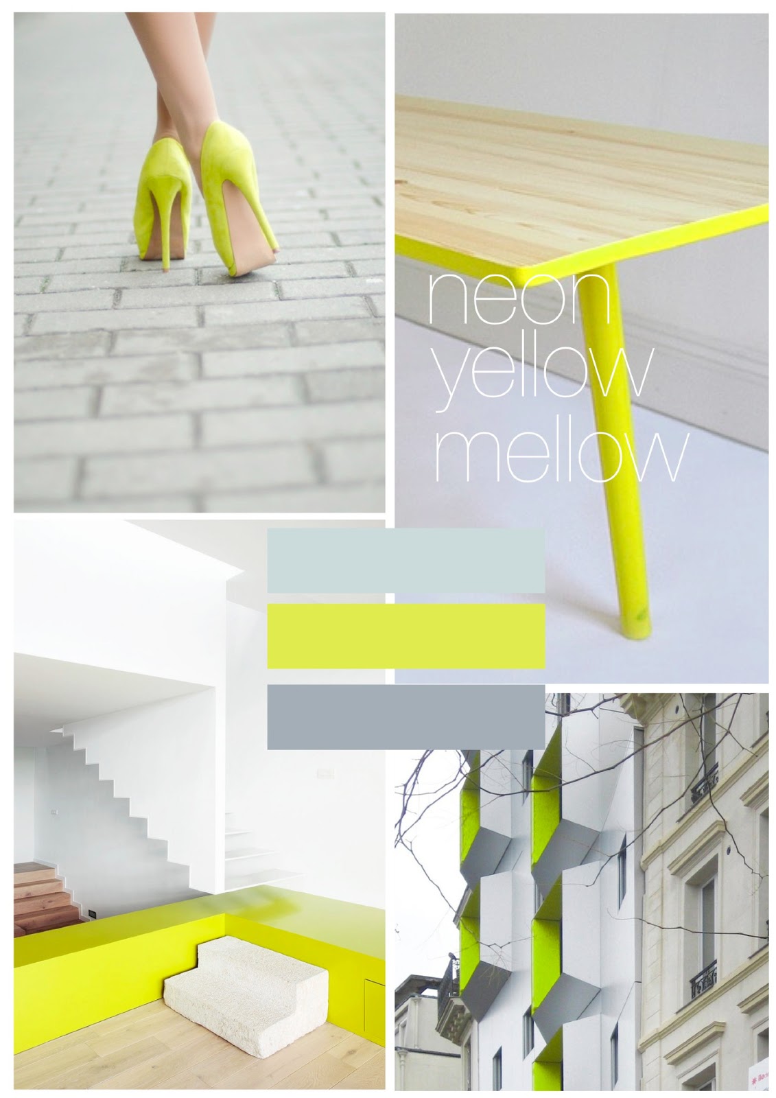
Neon Summer


It has been a while since I posted new items on my blog. I can tell you it wasn't on purpose. I had a back injury. And due to a lot of pain I had no inspiration at all. While I was at home I was able to look at many magazines and I noticed that there is a neon explosion going on. In fashion, interior, food. You name it. Almost anything you see has a touch of neon. It has been predicted at the salon de mobile 2012. But wat the salone de mobile did not predict, that it would take these kind of measures...
I predict that it will be a bright and neon colourful summer.

all images are from pinterest


Sunday, December 30, 2012

Monday, December 24, 2012

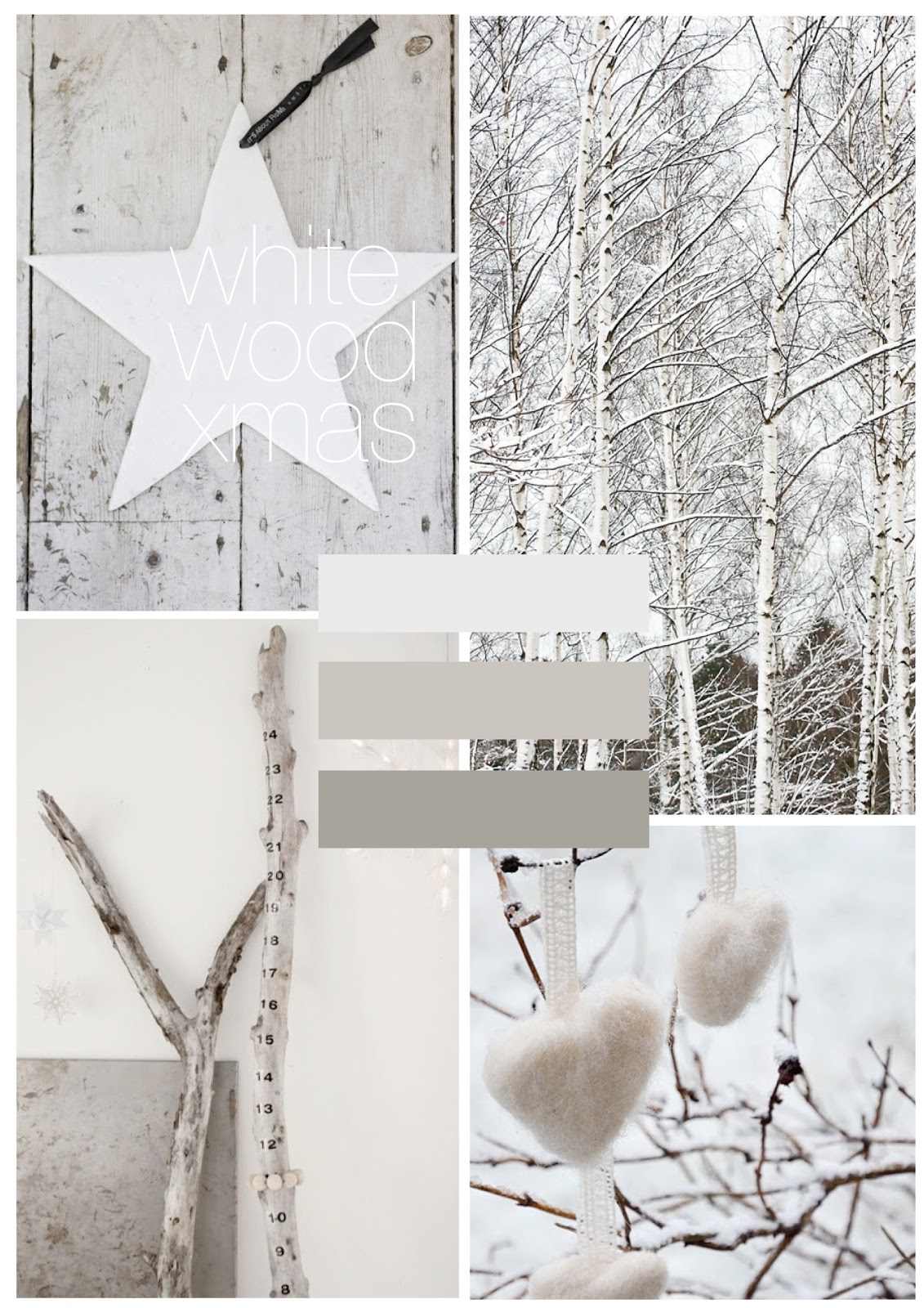
Xmas Colourcards


You might get into the christmas spirit with one of these colourcards. Just pick one and start styling your home. Happy holidays to everyone. Where ever you are....

Wednesday, December 12, 2012

something old... something new...


All I want for christmas is...
This beautiful minimalistic kitchen. The contrast between the old ceiling and the new design of the kitchen cabinets is outstanding.

image MILK

Monday, November 26, 2012

Monday, August 13, 2012

monday moods...


Can't get out of my lazy chair. Have to have three cups of coffee, before I can even think about the word WORK...
Am I the only one at the office? I guess so...

Images by
1. Paulo Mendes da Rocha at designboom
2. amanda rodriguez
3. object

Tuesday, August 7, 2012

playing with energy...


I wish I had invented this.
As part of his senior thesis exhibition at Musashino Art University in Tokyo, art student Yasutoki Kariya re-imagined the ubiquitous desktop gadget, Newton’s Cradle, using a lovely sequence of light bulbs. Entitled Asobi (which translates roughly as “playing“) the 11-bulb installation creates a visual interpretation of the popular toy named after Sir Isaac Newton demonstrating his third law of motion regarding momentum: that for every action there is an equal and opposite reaction.
I think I will use this last line as my quote for today. Just going a little deeper...

Sunday, June 10, 2012

[UN] BRAND = BRAND [NEW]


I came across this great project by Andrew Miller called Brand Spirit. For 100 days Miller spray-painted a branded object white, to remove all the logos and branding. Yet some of the objects are still easily reconignized. I have put some of the images together. And I'm now thinking of using them as wallpaper to cover up my old and ugly wall in my study.
Thanks, Andrew Miller for giving me this great idea.