Tuesday, January 6, 2015
Monday, July 21, 2014
Friday, July 18, 2014
Friday, June 27, 2014
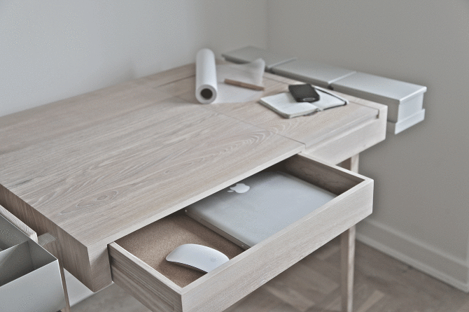
A PRIVATE DESK
A private desk by Theresa Arns
A desk made for a woman with an integrated mirror to check on yourself every minute. Because you will never know when somebody will walk in...
I just love the neutral colours of the white wood.
Wednesday, June 18, 2014
invisible kitchen
INVISIBLE KITCHEN
Does your kitchen also look like this?...
Well, I don't think so. But wouldn't it be nice to have a kitchen so clean and tidy designed by i29 interior architect?
http://design-milk.com/
Monday, June 16, 2014
Telling a story...

Last weekend I planned a trip to Copenhagen to attend a masterclass on photography & styling by meettheblogger. I had a great time. It was hard for me to figure out my photography skills. After the lessons from Tina & Jack Fussell I found out I have none. He showed us all the basics you need to know when you are starting to use your camera for the first time. Do you know I have my camera for over 6 years? And I just found out how it really works on Saturday. We also had to work with a model. I have never done this before.
At the other hand the styling class taught by Wendy from Beeldsteil was easy for me as I have a Artemis styling academy background. But Wendy taught me one good thing... To open up your legs when you are taking photo's on the floor. Why have I never thought about this? She also talked about light and to really look carefully where the light is coming from. She talked about the F-stop and we got a nice little list of when to use what F-stop.
We worked with beautiful products from Muuto, Vipp, Simply chocolate and Farrow and Ball
All the teachers explained that it is all about telling a story. Can you guess what my story is all about by taking a look at my photo's?...
At the end of this class I was also inspired by Marina Snijders from Meet the Blogger to start using my blog again.
As you can see I just followed her advice...
Wednesday, May 28, 2014
Black & White Loft
Just love the swing doors together with the black floor in this NY loft. I am tempting to do this in my home. But I am to scared to ruin my old oakwood floor. What do you think? To do, or not to do?... that is the question.
http://www.elledecor.it/magazine/Loft-design-new-york-total-white
Wednesday, May 21, 2014
Copper it is !
It is all about copper...
beautiful styling by Heather Nette King for
The Age M Magazine featuring gorgeous copper light pendants from, among others, &TRADITION, Tom Dixon, lightly & Coco Flip
Wednesday, November 20, 2013

No gifts yet for Sinterklaas and Xmas?
Come to the Stoflab on the 1st of december.
With so many creatives in one building, you will have to find something nice.
And when you are passing by at the Stoflab, Just take a flyer with you. So you will receive discounts on interior styling workshops or interior consults
The entrance is free. Hope to see you there.
http://www.stoflab.nl/see-try-and-buy-exclusieve-sale-in-het-stoflab/
Thursday, November 14, 2013
Aviation in your home
How can you combine interior design with aviation? Well, like this. I'm brainstorming about styling a new home for a pilot.
pictures: http://www.labohemeblog.com/
Tuesday, November 12, 2013
The Dutch Design week.
I know, I know... I am a little late with the highlights of the dutch design week. To me it was a little disapointing because I didn't get to see everything due to lack of time. Next year I 'll have to work on planning. But I just don't want to keep this highlights from you. The photography is done by me.
Sunday, November 10, 2013
Faded 101 Karakters Piet hein Eek
Yesterday I had a very great and creative day. As a winner of the histor contest I was invited to the Piet Hein Eek studio and workspace to paint my Piet Hein Eek Cabinet. It was nice to see that the histor decorators all ready made a start. They sprayed my cabinet with the colours black, mus and loom (white). To my surprice it turned out even more beautiful and interesting than I imagined. So I left it this way and there was less for me to do, only the inside of the cabinet I had to paint myself. In a few days I will show how the inside turned out. Untill then it's still a secret...
Wednesday, October 23, 2013
Piet Hein Eek competition by Histor 101 karakters
I have something really exciting to share with you today!
Out of more than 2000 dutch people who entered the competition of
Histor 101 karakters, I'm one of the lucky ones, that has been chosen to
create a Piet Hein Eek cupboard with Histor paint. So I am expected to be in Eindhoven on the 9th of november at the creative and inspirational office of Piet Hein Eek.
And the good news is...
I get to keep my very own creation.
Friday, October 18, 2013
Thursday, October 17, 2013
Piet Hein Eek Histor 101 Karakters
This week I entered the Piet Hein Eek 101 karakters competition for Histor.
This is my moodboard and design. I hope you'll like it.
Wednesday, October 16, 2013
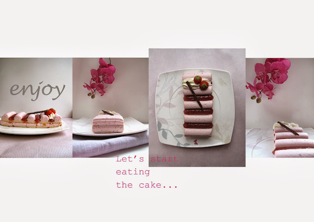
Sharona's Cakes
Monday I gave Sharona's Cakes a private workshop foodstyling in her own home bakery. It was fun to do and we only worked with day light. Altough it was a rainy day, the pictures turned out beautiful.
Unfortunately I had to rush to an other project after the workshop and I forgot to eat the cake. So next time I want to have two slices...
Friday, September 13, 2013
Thursday, August 22, 2013
Wednesday, August 21, 2013
The Pin Gallery

Vision is everything... Where would we be without our vision? Sunday I visited the pin gallery. As a pinterest addict I had to attend this exhibition. 8 pinterest lovers studio sjoesjoe, 101 woonideeën, April & May, Anouk B, Rose Eberson, Marieke Noordanus, Wimke Tolsma and Ank | 2D studio in vorm, were chosen to show 5 pins they love the most. What a great idea! The location of the exhibition was amazing. As you can see on the pictures I took. It was nice to read why these images were selected. The theme for the exhibition was called eye candy. But what is eye candy to you? I guess it's different for everybody. I think it is influenced by your vision and how you look at things and what's important to you. To me eye candy is not only by looking at great images but the image itself has to tell me a story, give me some kind of feeling or show me an emotion. If the image got all of the above I will place on my pinterest board. That is how I keep my pinterest boards By SISSA personal. I have selected my 5 favourite images from my boards. The catagories are Travel, Typography, Art, Food and Photography. Together they tell me the story. I have selected these images because they tell me a story about travelling. For my work I have to travel a lot and I get to see the world but only through my very own eyes. What do you see when you are travelling? You see the people around you, but what is their story? Have you ever wondered? People have emotions, but can you see them? Where have they been? And what have they been through? Where are they going to? And have you ever wondered where the fish went before it ends up on your plate? I guess not. And if you see a proud african woman, what's her story? Will she tell you the truth or will she tell you how proud she is... We all got our own story to tell just by using our vision. So what is your story?...
Images
1 Travel: weissesrauschen
2 Typography: Etsy
3 Art: Nezart Design
4 Food: cereal
5 Photography: Chameleonvisual
Thursday, July 18, 2013
Creative Mind
Today I will take you into my creative mind. I will try to explain how my mind works. I got the assignment to design a logo for Kees Folkers. Through my facebookpage I found the image with pots and pans. This made me think of the letter L reflected in a mirror. This is why I thought I have to reflect his work. In my mind the L stands for Love. My client who is an interior & stageset carpenter has a lot of love for his job. So first, I made the letters in a L shape, but I wasn't satified. So I hussled the letters and separated them. Just like the pots and pans. I turned the image 90 degrees. And the words came out. The design of his name was a fact. I knew my logo had to be clean and simple. because my client is a down to earth person. He is a person that doesn't want to be upfront. That is why the jacket is placed behind the images. He doesn't want anything fancy.
In the danish vintage dresser I saw the straight lines that had to go with my logo. It also looks like the dresser is floating on top of the frame. So I placed the line on top of the name. And let it float.
I'm also a great fan of pinterest and I search the site every day. This time I came across this pendant in copper because I was looking for items in copper for another project. (A creative mind works 24 hrs a day...) In this shape I saw the lining for my client's logo. I thought it had to be something with a round shape. But what? I tried out several things but came to the idea, to keep it simple. I placed it around the logo. When I spoke to Kees Folkers and showed him my first design. He told me that he was satisfied and he wanted the letters to be in black. He also told me that he was going to the forest for the weekend. When I heard the word forest, I could see the colours that my logo needed. This was the only thing that was missing. I just don't know how this works. But when you think of something you're working on, you just see it every where. I bet it happens to you too. That's how I came across this jacket. The perfect colour for my newborn logo. I hope you like how it turned out.
images from
The retro age
Catherine Scheen
Lukas Peet
Subscribe to:
Comments (Atom)


